Our Rental Kitchen Makeover

The kitchen is finally finished!
Gosh, how long have I been talking about this rental kitchen makeover? This technically started in October and was only just finished last Sunday. Some part of it was setbacks, most of it was laziness. The setback was that our kitchen flooded (thanks to the previous tenants). It took a while for new flooring to be fitted (it was reported in October- it got installed in January). The laziness was knowing how long it would actually take, this wasn’t like the living room makeover where we would be just painting a few walls.
This rental kitchen makeover involved repainting the walls, painting the cabinets, replacing the floor (when it got damaged) and covering the damaged countertop. It was a big job. After a couple of months of literally staring at a notebook of to-do lists, we got a paint brush out and started working on it.
The change is huge- as you can see in the photos below and my post on my plans on the kitchen makeover plans. Here is the reveal of our rental kitchen makeover…
BEFORE THE MAKEOVER.

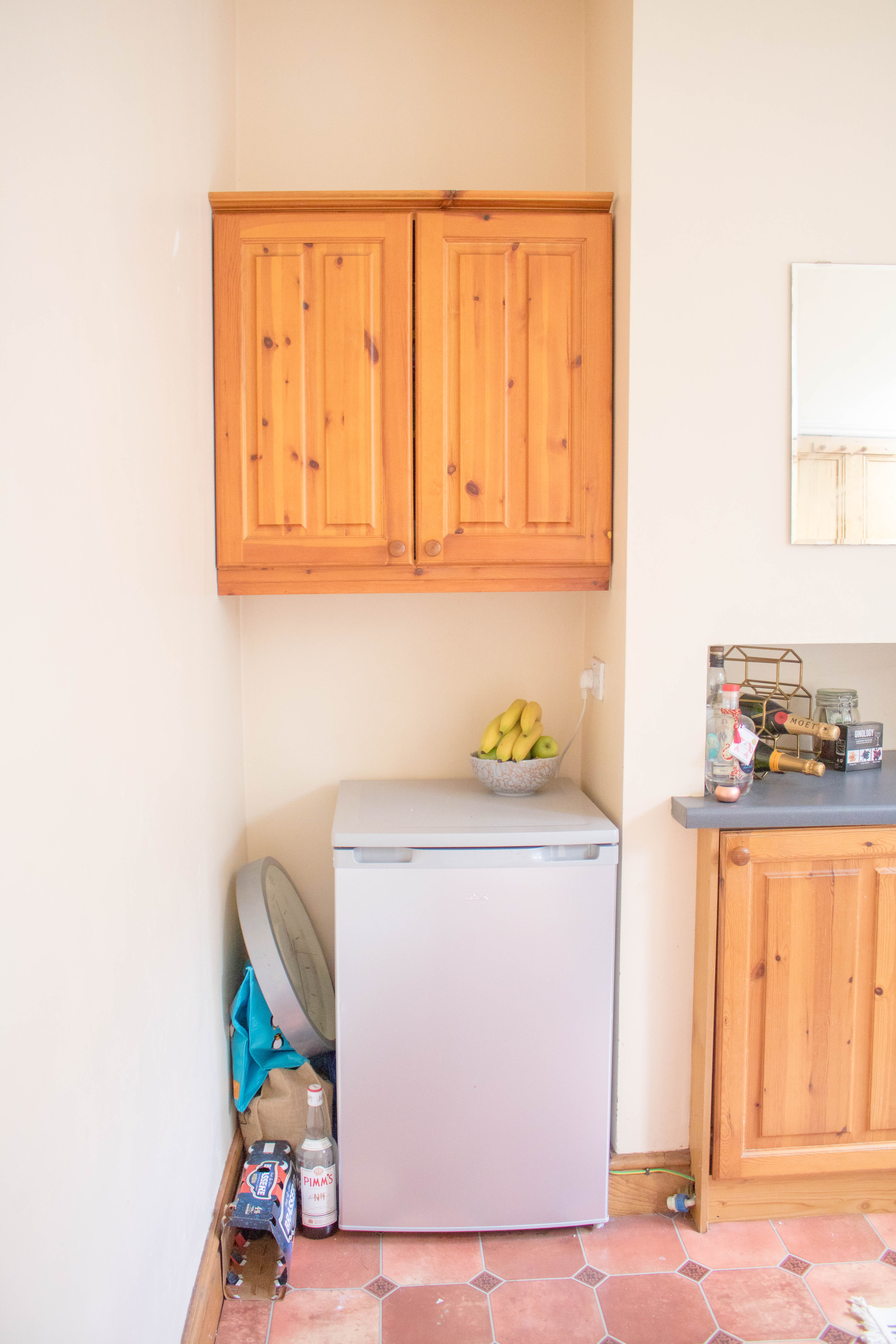
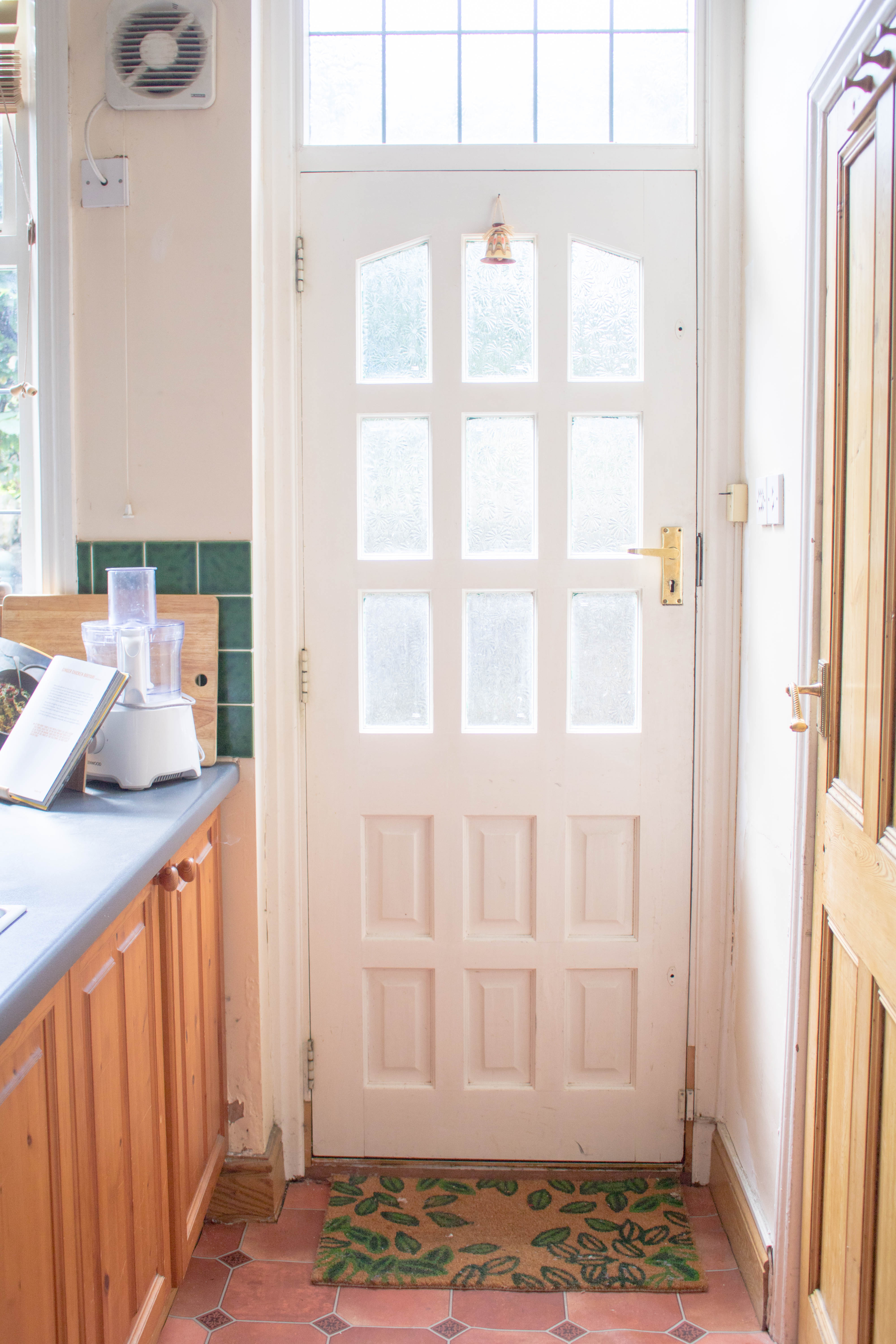


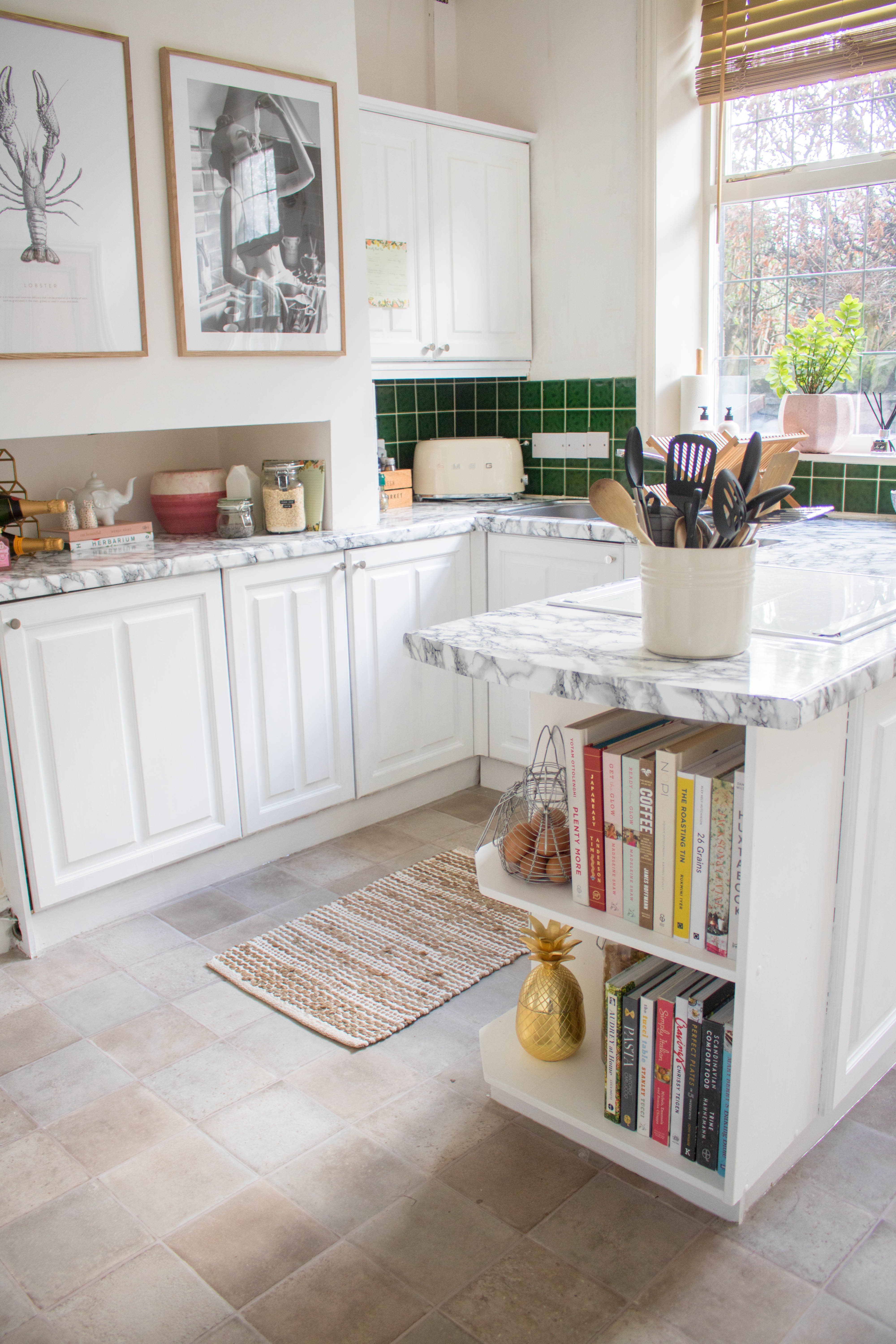
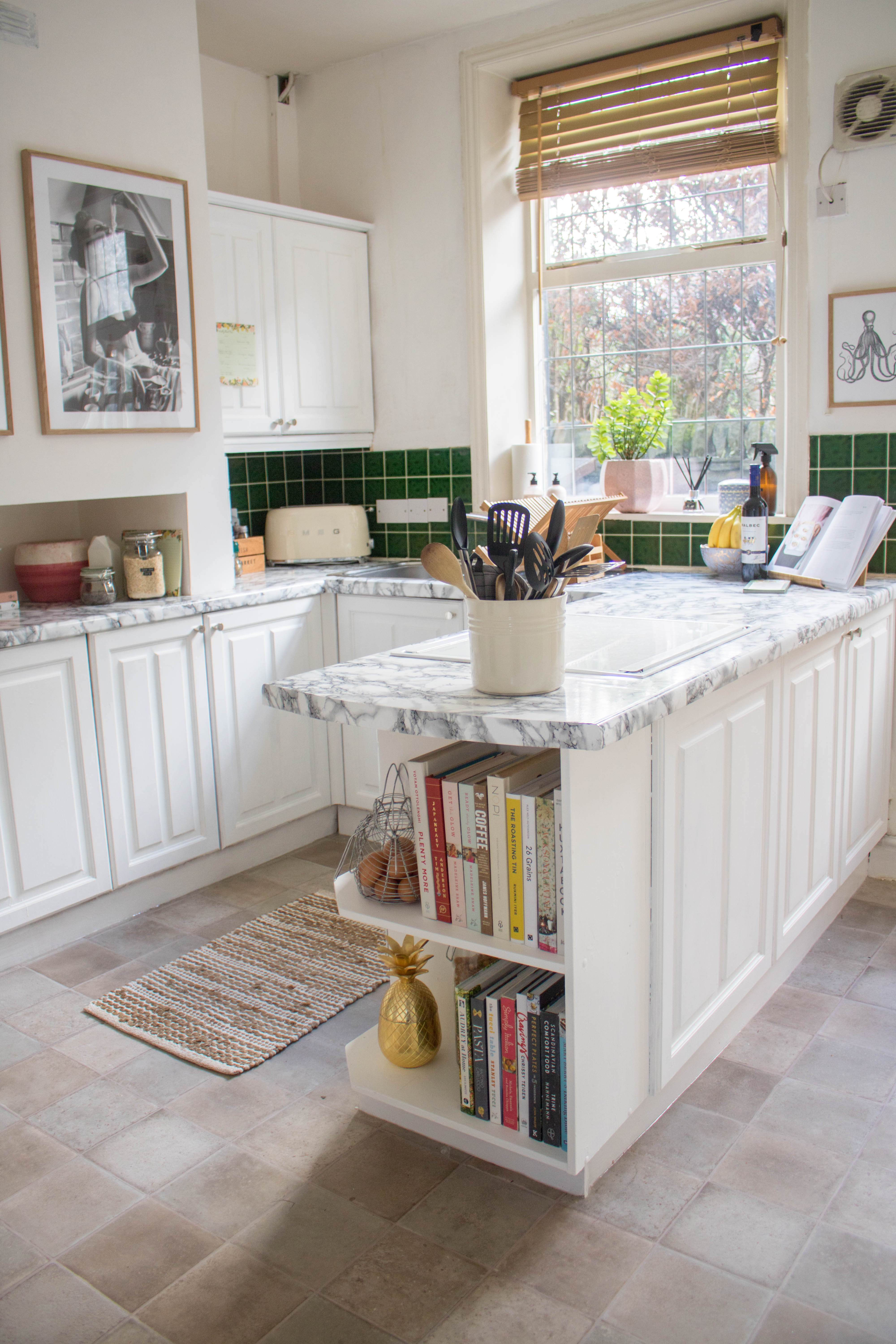
AFTER THE MAKEOVER.
It’s amazing how changing a few things up can make a difference in your home. The flood in the kitchen was a blessing in disguise. It’s made an amazing difference, even before we started painting the walls and the cabinets. It made the room look ten times larger. If I owned this home, I would have gone with wooden flooring with underfloor heating. Such a luxury and would have been amazing to have toasty toes in the morning.
Next was painting the walls and the skirting board. I can’t remember exactly what emulsion we used for the walls, but it was a 2.5L tub and cost no more than £20.00. Cheap and cheerful and did the job. The kitchen has never been finished properly, so some of the walls are uneven. So I really didn’t want to pay too much for paint, just something to take away the magnolia. Same with the skirting board. Some of it is not flushed to the wall or there are cracks and gaps. I picked up a cheap oil-based undercoat and a semi- eggshell wood paint from B&Q. Both tins cost me about £15 altogether and they painted all the skirting boards and cupboards…
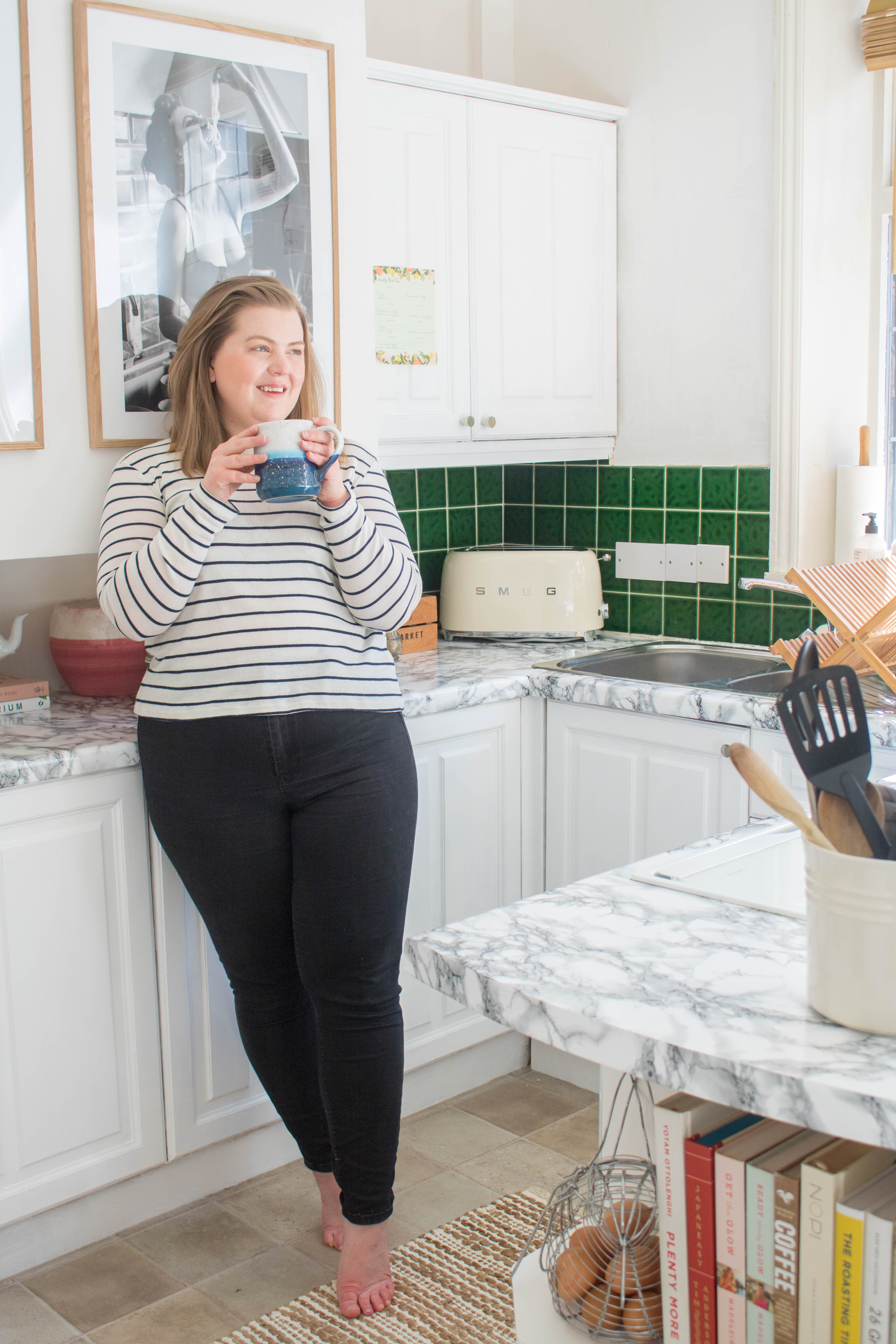

ADDING ADDITIONAL STORAGE.
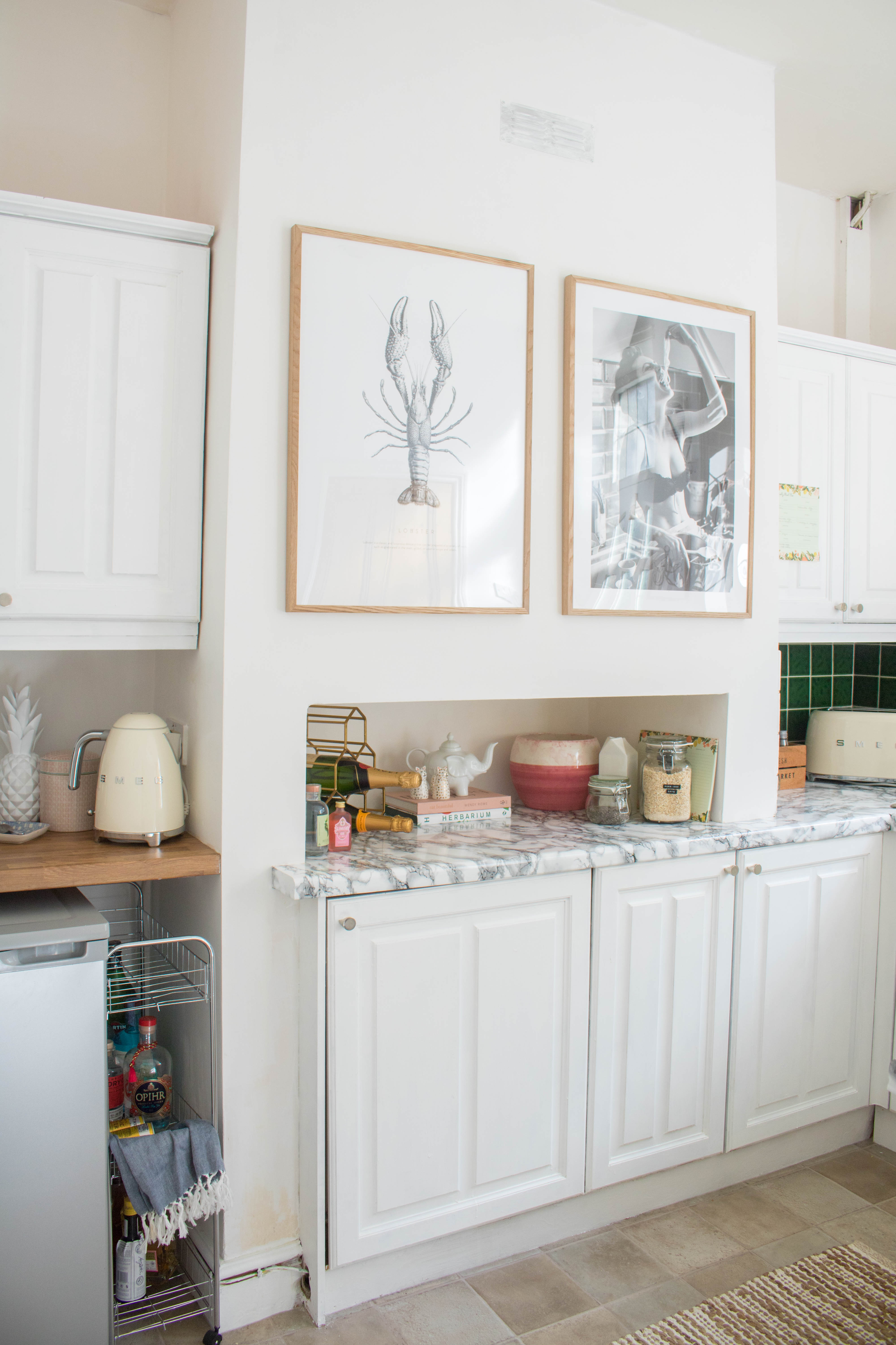
This kitchen lacked smart storage and surfaces. If I’m honest and I owned this home, I’d completely change the layout (and yes, I’ve spent many a night on the Ikea kitchen planner). One area that I knew we could gain extra counter space was over the freezer. A quick trip up from Lincoln and my dad installed this countertop which he got for next to nothing at B&Q. Made me a small gap for the freezer plug to be able to go into the high plug socket and away we were. Now it’s my coffee station, where my Nespresso machine and new Smeg kettle sit proudly.
For the tiny gap, I searched high and low for a trolley what was small enough to go in the gap. This one from Amazon is cheap and cheerful. It does what it needs to do.




COUNTERTOPS AND CABINETS.
For painting the cabinets, we used the same undercoat and wood paint. The best thing about that primer meant we didn’t have to sand down the cupboards. This made the job of painting them ten times easier to do. These fabulous knobs were from my work Dowsing & Reynolds. It’s amazing what a bit of hardware will do to a kitchen!
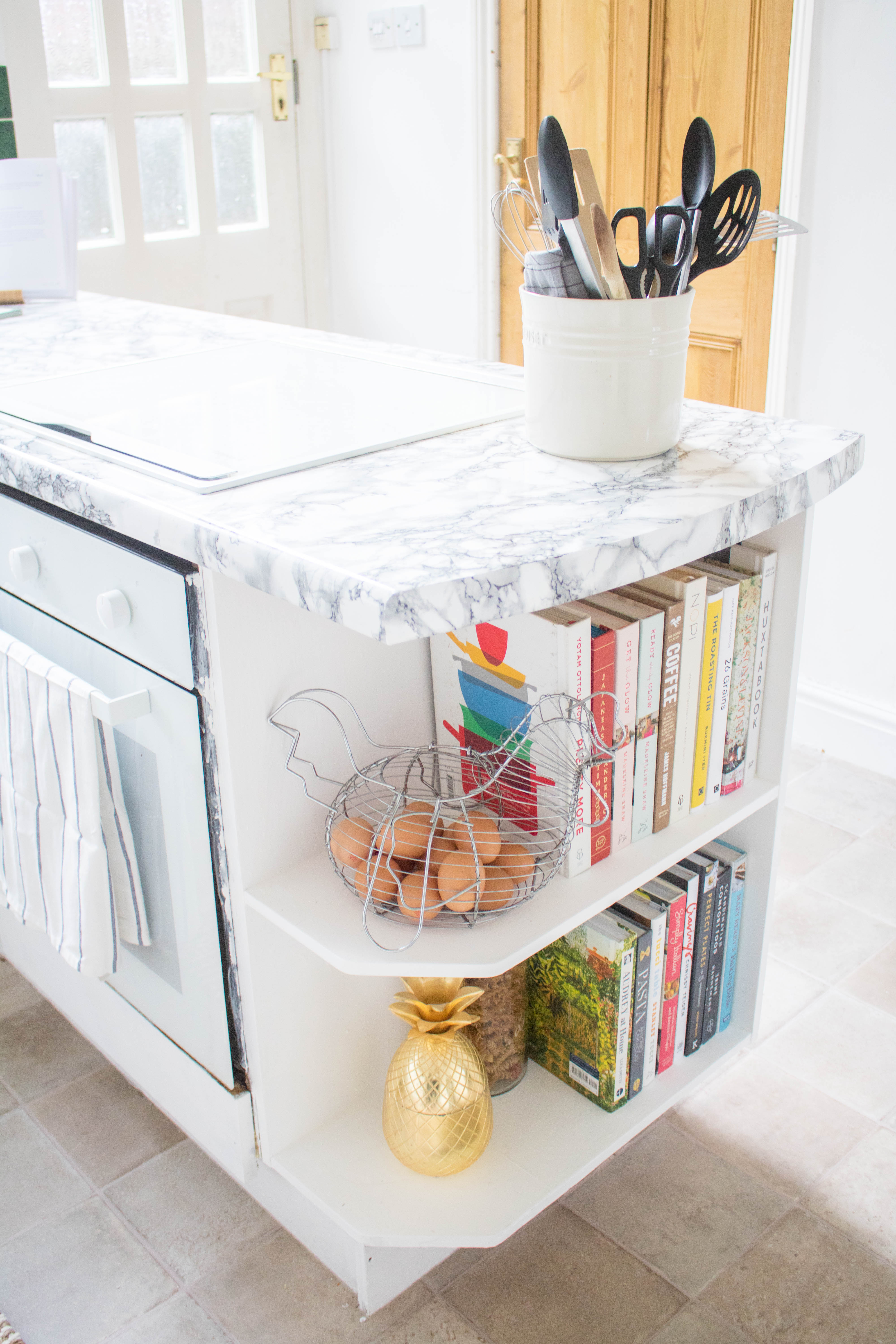
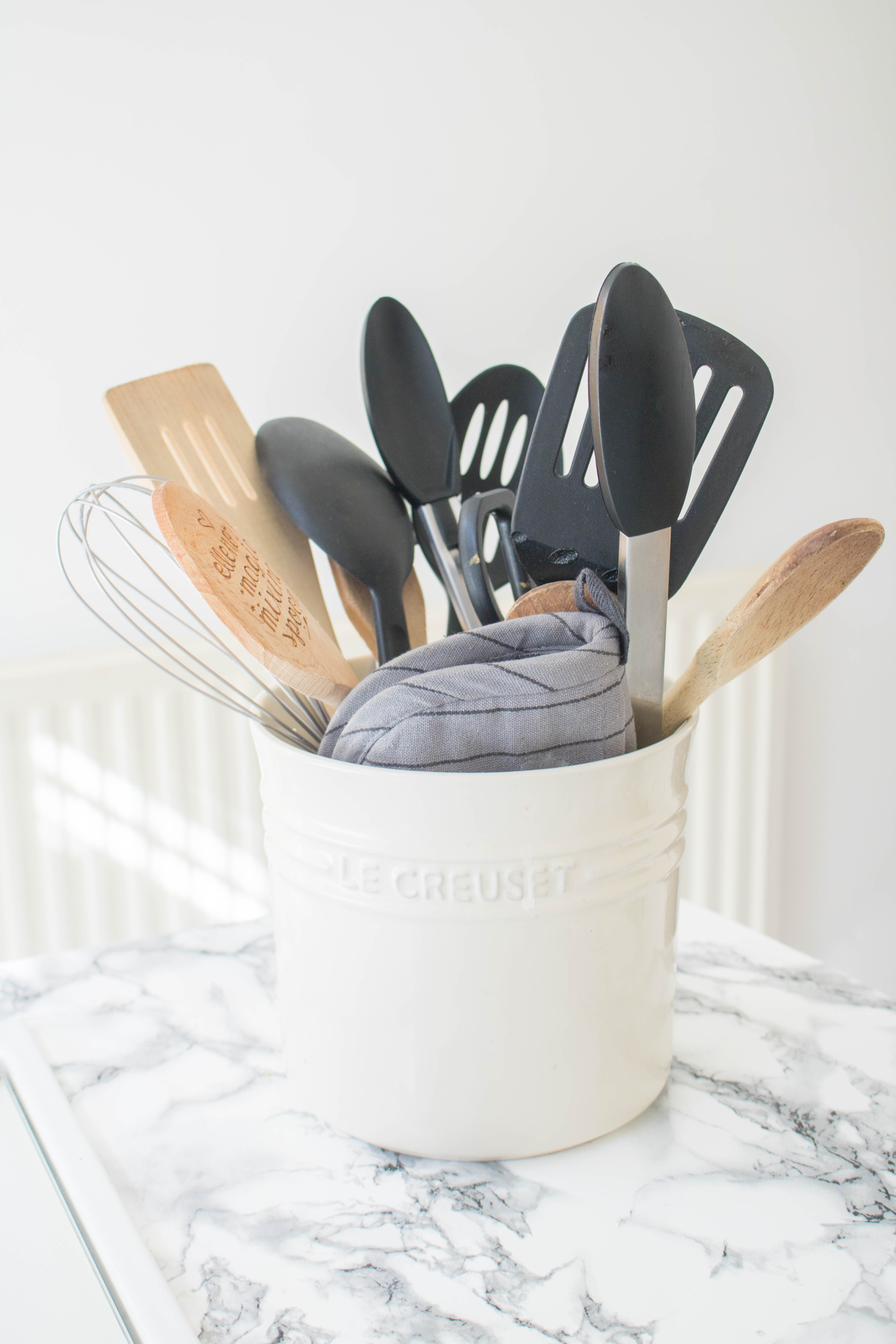
For the countertops, I knew I wanted to cover them with contact paper. For a rental kitchen makeover, this is a must! It’s removable, will not leave marks and turns a kitchen from drab to fab in a matter of minutes. The contact paper I got was this marble one from Amazon. The key with contact paper is to take your time and not rush the job. Patience is key, and you can see what a difference it makes. Plus, it’s removable. So I can peel it away when we leave the tenancy and there’ll be no damaged.




THE FINISHING TOUCHES.
Once the main bits of DIY was completed, it was time for my favourite bit. Decorate! I started with the artwork. I knew I wanted to remove those awful wall mirrors that seem to be a requirement with every rental. Once gone, it was time to pick some prints that would compliment the space. For me, there was nowhere else to look other than Desenio. I love their prints. And luckily, we collaborated together on this post, along with Friday posts, where there might be a treat for you lucky readers. We went with an Italian/ seafood theme and they work so well in the room!
Recently, I’ve been really inspired by American decor and that South Californian feel. Neutral tones, natural textures, the works! Similarly, I wanted to bring back some wooden textures into the rental kitchen makeover (just not the pine). For example, the bamboo draining board fits perfectly in the room, along with the wooden kitchen roll holder.
UPDATING THE APPLIANCES.
With a new kitchen, I had to treat us to some new appliances. Along with the kettle, AO.com was kind enough to gift us with a Smeg toaster. The toaster is absolutely gorgeous! All the Smeg appliances are beautiful and worth showing off!
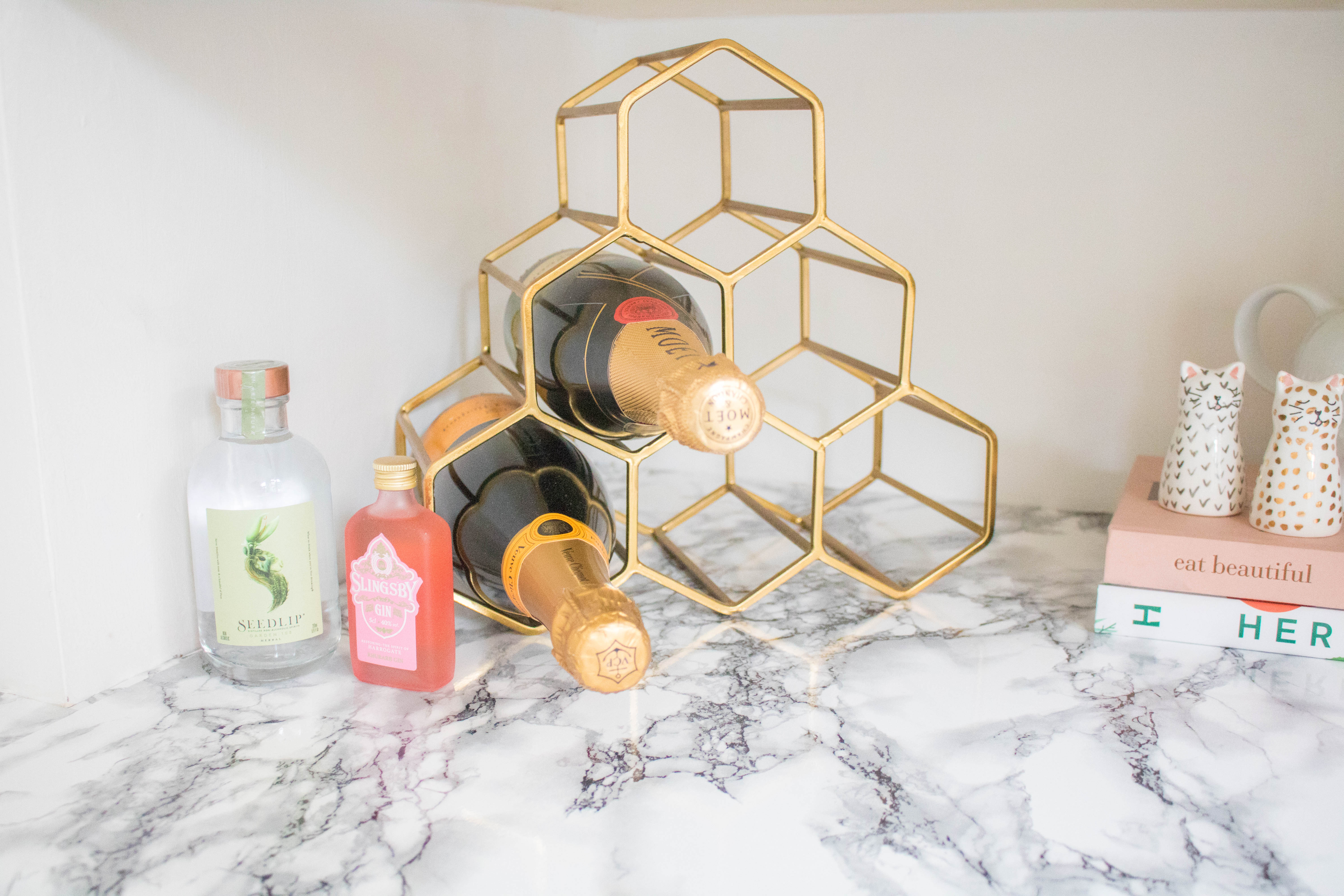
Finally, it was time to place the cookbooks in a stylish way and display a few personal items. The alcove that is cut out of the chimney is a difficult space to use. Luckily, it’s perfect for our brass wine rack. In addition, it’s a great space for our breakfast station.
I hope you’ve enjoyed the tour of our rental kitchen makeover.
I’m hoping to do a post on my top tips on how to decorate your rental home. So, if you need any tips, leave me a comment or hit me up on Instagram. Happy to help fellow renters in need.
The Smeg kettle and toaster was gifted to me by AO.com. The artwork was gifted to me by Desenio. All thoughts & opinions are still my own.

Ahhh this looks amazing girl! Well done!
x Lisa | lisaautumn.com
Thank you so much 🙂 x
OMG this renovation looks so amazing!! Its great seeing you being able to do this in rented accommodation
http://www.petiteelliee.com
Ellie x
I really love what you did with your kitchen and that green tile looks lovely with the re-done kitchen. It just add a pop of colour.
I am redecorating my house (we moved 2 years ago and previous owner taste is not ours) I have done my bedroom renovation on my blog if you wish to have a look. I am yet to do a post of my living room decoration etc.
http://www.mariesconnections.com/
Amazing! I’m glad you revealed the “after” prior to the “before.” I actually shrieked aloud when I saw the before. I couldn’t scroll back up fast enough to make sure I had seen what I had seen. I don’t think I would have believed it had the green tile not been there. (Which looks fine now, BTW.) Talk about what can happen just by changing surfaces! You’re a real talent.
Thank you so much, uoi’tr do kind 🙂 x